
This volume of angry-times includes art theory and views on painting in the tutorial that tell how I feel about painting now. This is NOT absolute thruth of the world and everything I say can and should be done the way you feel natural. The basic rules of colour and composition can be broken and used more creatively. This is ART people, the only place where everything is possible so whatever you do remember to have FUN!
Also "The Unwanted" is now available as a shiny pretty print.

I often get asked how I start my paintings. the truth is that I do almost every one of my paintings differently. It keeps things fresh and I always learn something new. So there definitely isn't one right way to do it.
I'm going to post to my journal this little mini tutorial how I do THIS particular painting to show at least one side of my work methods. I won't cover the basic painting info you can see in most tutorials so that I'll have space to write something you maybe haven't thought of before.
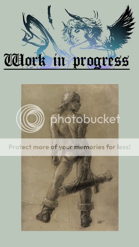
The first thing is to have an idea of what do you want to do. If you don't know what you want it will make it hard to solve problems later. Sketch like this is a good place to start. I was inspired by a very bad but visually beautiful movie "Caravaggio", because Caravaggio and Remrandt have always been my favourites I want this painting to have a same kind of play with light and shadow as their masterpieces.
It is very important that when you sketch you also consider the overall values of the image. Choose if your image is going to bee mainly dark, mid-value or light. Not 30% of everything.
Here the image is going to be mostly dark with some mid-values and even less bright light. The composition is going to focus on light and pull the viewers attention to the light areas where they form the biggest contrast with the dark background.
It should be noted that my way of painting with light colours on dark background is very odd so experiment what is the most natural way for you to define forms.
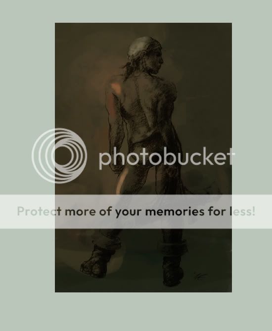
Here I've lifted the drawing on a layer above background. Building your colours with light opacity brushes on white background isn't a good idea if you don't intend to leave your background white. The white will get glued to all over your painting as you colour pick the colours that are glazed over it.
At this stage the image is still quite small to throw around big area's of colour quickly.
Decide the COLOUR of your light source. White light hardly ever appears in real life and it's most easy to paint but also boring to look at. The colour of your light controls the colour of your shadows. The shadow colour is always the complementary colour to the colour of light. Naturally remember that by colour I mean that the obect's local colour has the shadow colour's hue on it. So red object can still look red in green shadow sometimes when the shadow colour is only a see-through glazing on it.
The hardest pat in the colour of the light source is to change hues all over the painting. The intensity and the hue of the light-colour can't be same everywhere because it will flatten the feeling of space and lessen the depth of the painting.
The rule of change applies to everything. Vary the shapes that look too close to each other. Vary the colours of objects so that the use of colour won't appear monotonous. Vary the sharpness of surface edges. Sharp edges appear to be closer and draw most attention. Also intensity of of hues should be most bright at the area where you want the viewer's eye to be drawn to. If you want the centre of interest to be far away in the distance you have to make the composition point out the location clearly enough so that the bright colours in the foreground won't steal the show.
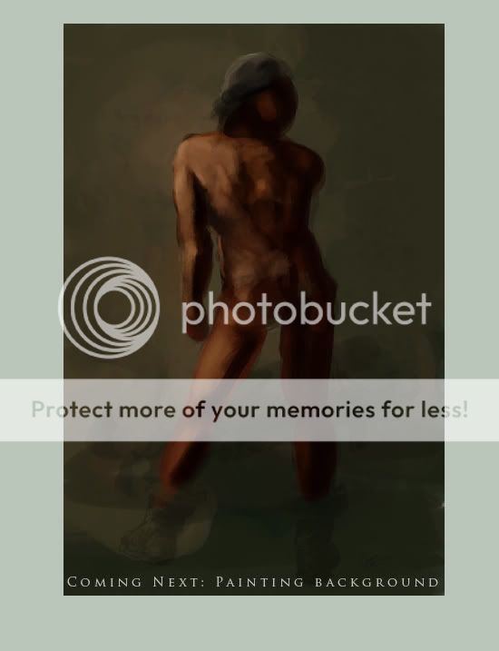
So here I've used a very BIG brush to quickly flesh out some basic hues and values that are going to be the most important in this painting. Don't worry if you're going to make mistakes because that's what this face is all about; doing it wrong so you have something to fix and a direction where you are going to. I'm painting the skin on it's own layer but I'm working on the whole painting at once.
The character's shoulder skintone is bleeding to the background so that they look like they are both part of the same scene this also gives an impression of thick atmosphere. More importantly it breaks up the hard contrast between the character and the background wall so that the guy won't look like a cardboard figure when it's complete.
Bouncing light and colour off surfaces is very important to add realism and depth to your work. Remember that all materials don't reflect light the same way. Matte surfaces suck the light to themselves while glossy surfaces reflect the colour of light + the local colour of the object to the objects where the light is reflected to.
Don't let the term "bg" fool you- the background is just as important element in the composition as that whatever you are painting. It will add the feeling of space and moment + your painting will actually look finished when it's complete.
At this stage before I start to work on the details I reduce the opacity of the drawing layer to 30%. If you want your image to look three dimensional then get rid of the lineart. Lines are a good excuse to leave paintings unfinished because the forms are so easily described by a few lines. Black lineart yet again is one factor that causes the space to flatten in your painting. Amazingly real life doesn't have lines. So it comes down to the question if you want your image to look realistic or not?
More thoughts on details when the time comes!
Thank you for reading and remember that I can aswer to any questions you might have. I read and reply to all my notes too.
Crazy talent alert!
 :thumb35813971:
 :thumb51914672: :thumb40365074: :thumb40250832: